Empowering rainbow and takatāpui communities
A team of queer creatives designed this project with a strong commitment to their community and Tiriti-centered approaches. They aimed to create a genuine brand that represented and provided opportunities for takatāpui and rainbow communities at a New Zealand University. Their efforts led to Kāhui Irarau, a groundbreaking platform providing a safe and inclusive space for support, connection, and strengthening initiatives around diversity and inclusion.
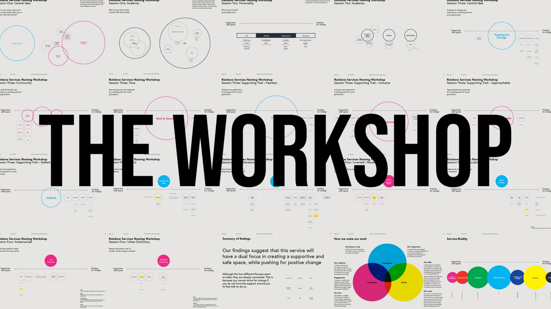
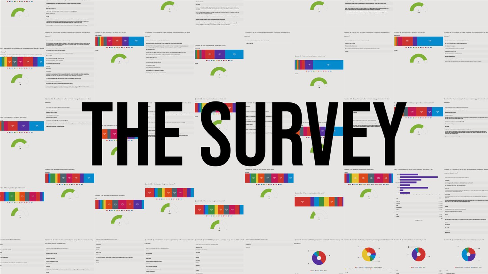
The process began with a workshop with the community in Wellington. Participants collaborated using design thinking tools to generate ideas—the outcomes captured initial brand names and positioning statements. Following the workshop, an online survey was distributed through an internal campaign to engage with alumni, current students and staff from various campuses, and distance learners. This approach ensured inclusivity, and the survey received over 120 responses.
By prioritising the voices and experiences of the community, the creative team validated and refined their design decisions. They discovered various themes, such as the need for a safe and supportive space and the collective desire to drive for positive change. Additionally, there was an overwhelming motivation for a Te Reo Māori name.
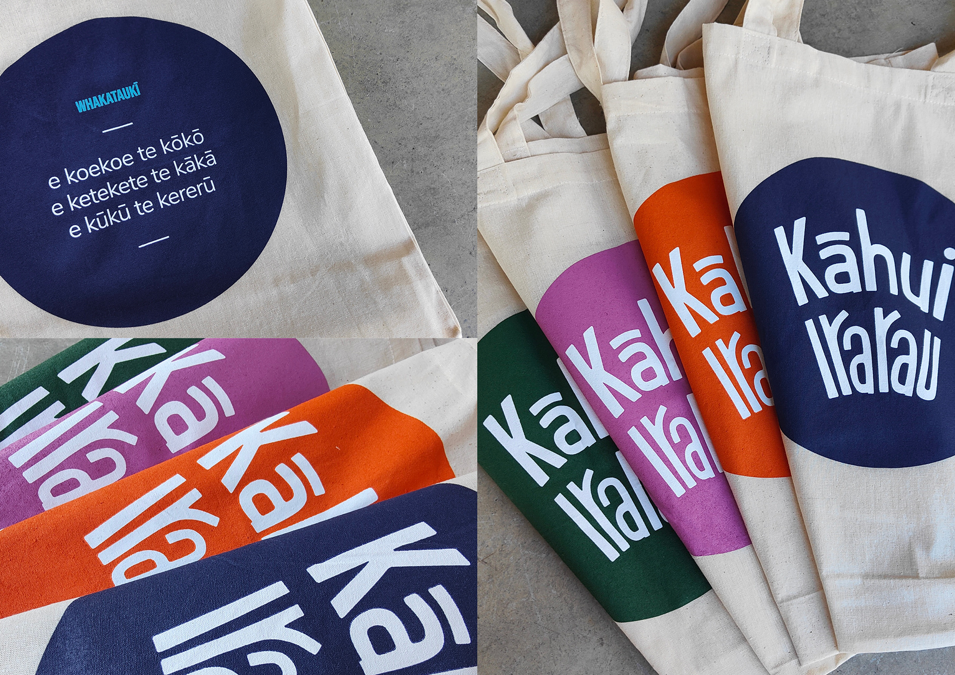
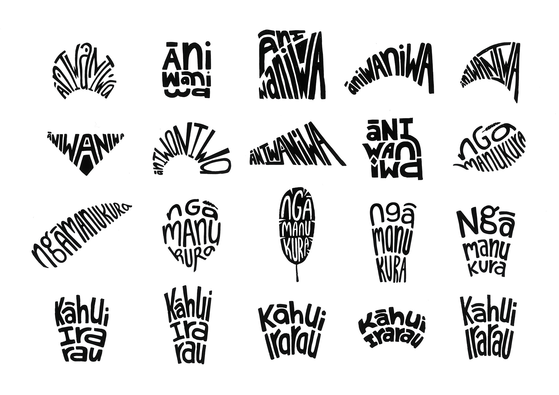
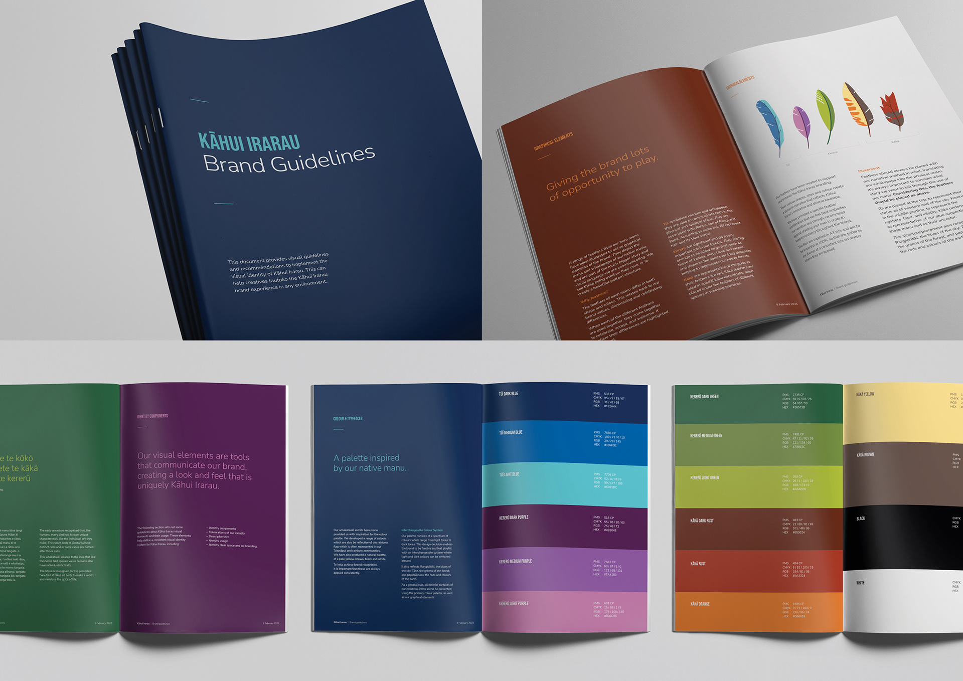
The designers crafted a visually compelling and narratively rich visual identity through thoughtful design choices. They participated in several months of wānanga, intention-setting sessions and collaborative hui. Through this effort, doctoral candidate Ngawiki-Aroha Rewita gifted the platform its ingoa with support from Associate Professor Hone Morris and Connor McLeod. The name combines the term ‘kāhui’, a flock, or grouping of both animate and inanimate things, with ‘irarau’, representing many life principles, genetic make-ups, and many genders. The platform’s kaupapa draws on the whakataukī ‘e koekoe te kōkō, e ketekete te kākā, e kūkū te kererū’, recognising the inherent and naturalised diversity of rainbow and takatāpui peoples.
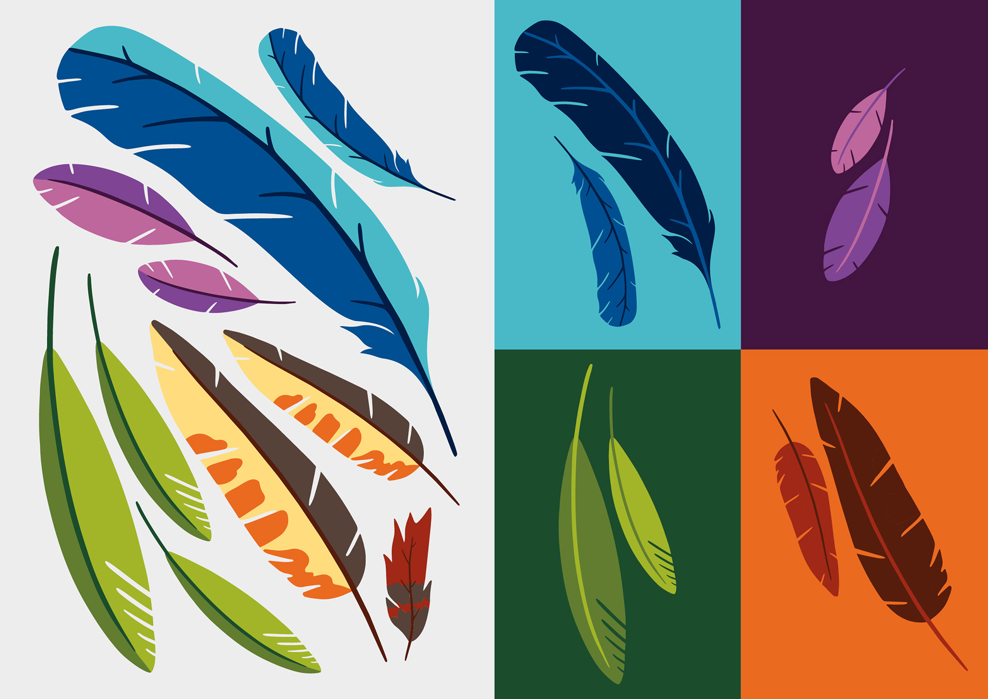
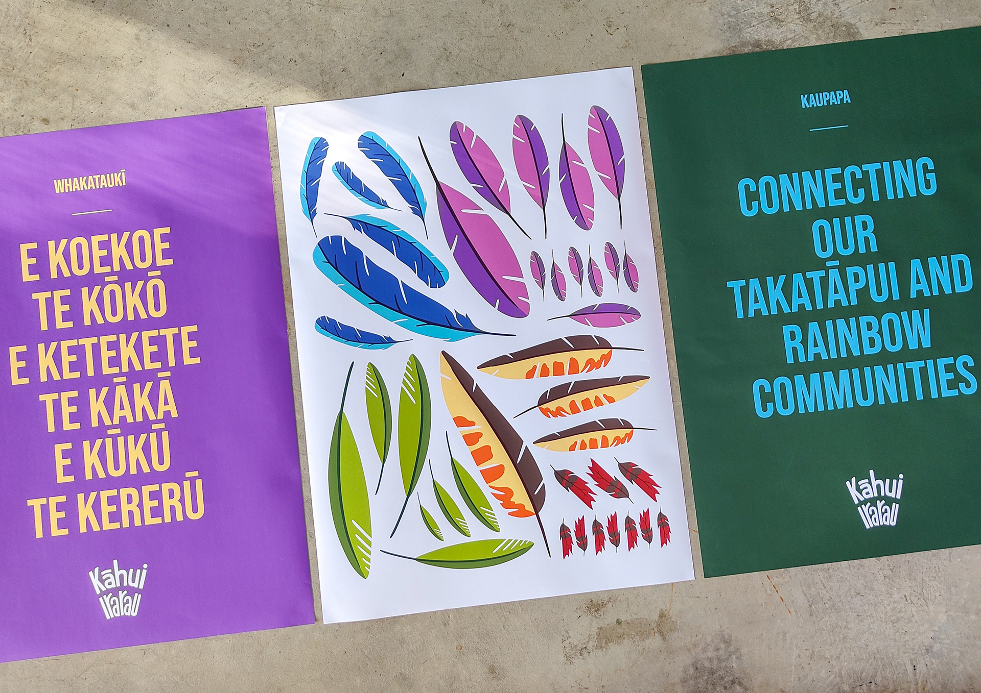
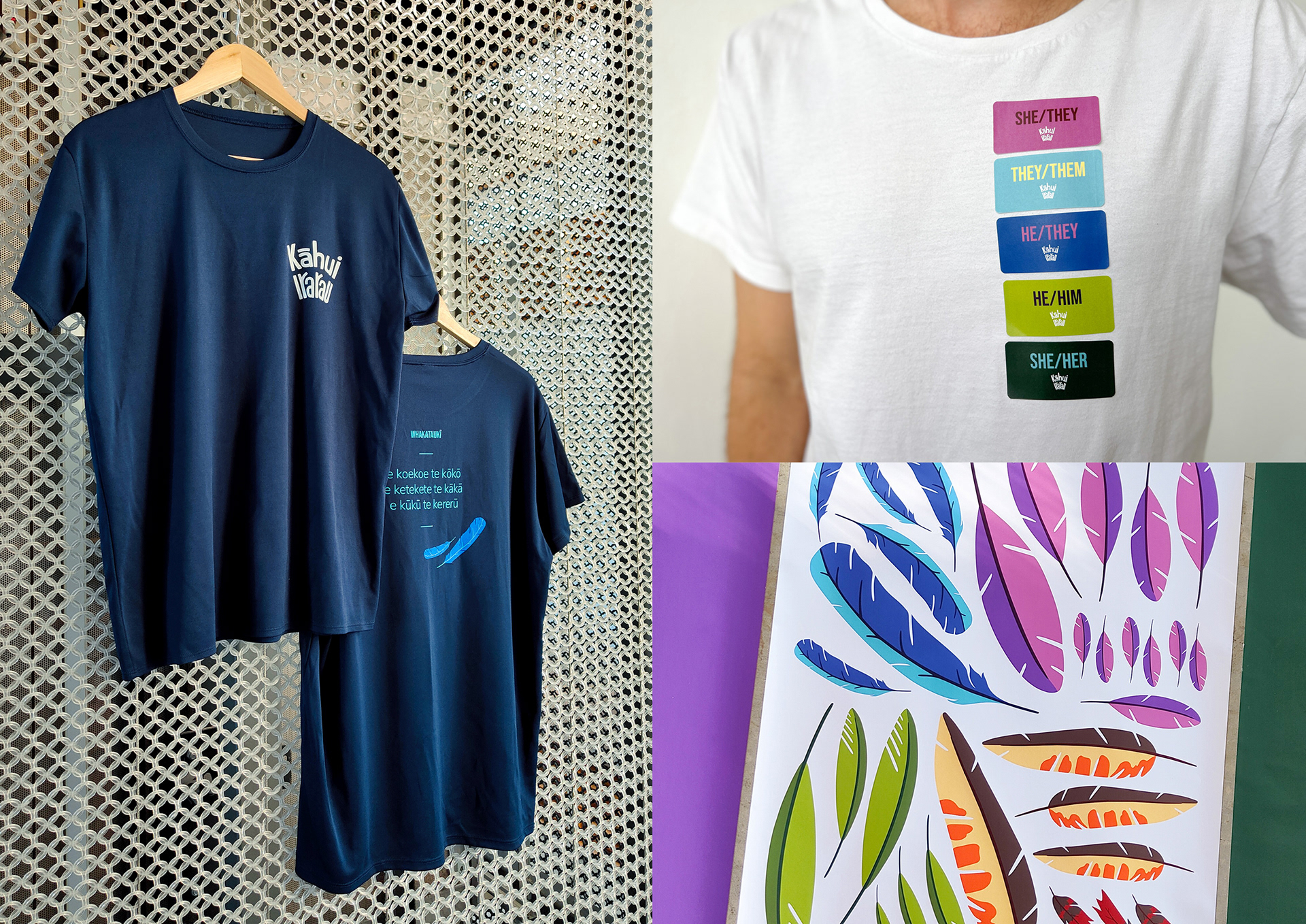
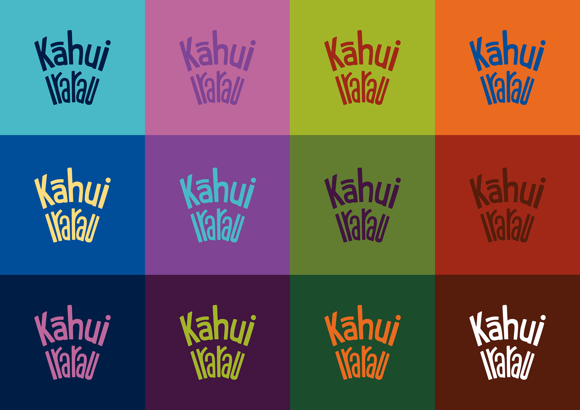
The hero manu inspired the colour scheme, which nodded to both the pride flag and the University’s brand colours. The palette comprises interchangeable light and dark colours mixed and matched for flexibility. The visual identity was designed to be approachable, with a hand-drawn logotype arranged to resemble tail feathers. Illustrated feathers of varying shapes, sizes, and colours were developed to enhance the brand’s storytelling of individuality and celebrating diversity. The arrangement of the feathers held significance, translating whakapapa into the physical realm. The tūī feathers symbolise wisdom and the sky; the kererū feathers represent the forest, food, and vitality; and the kākā feathers represent the support of the Earth and ancestral connections. The chosen typography, colours, and graphic elements contributed to an extravaganza of fabulousness.
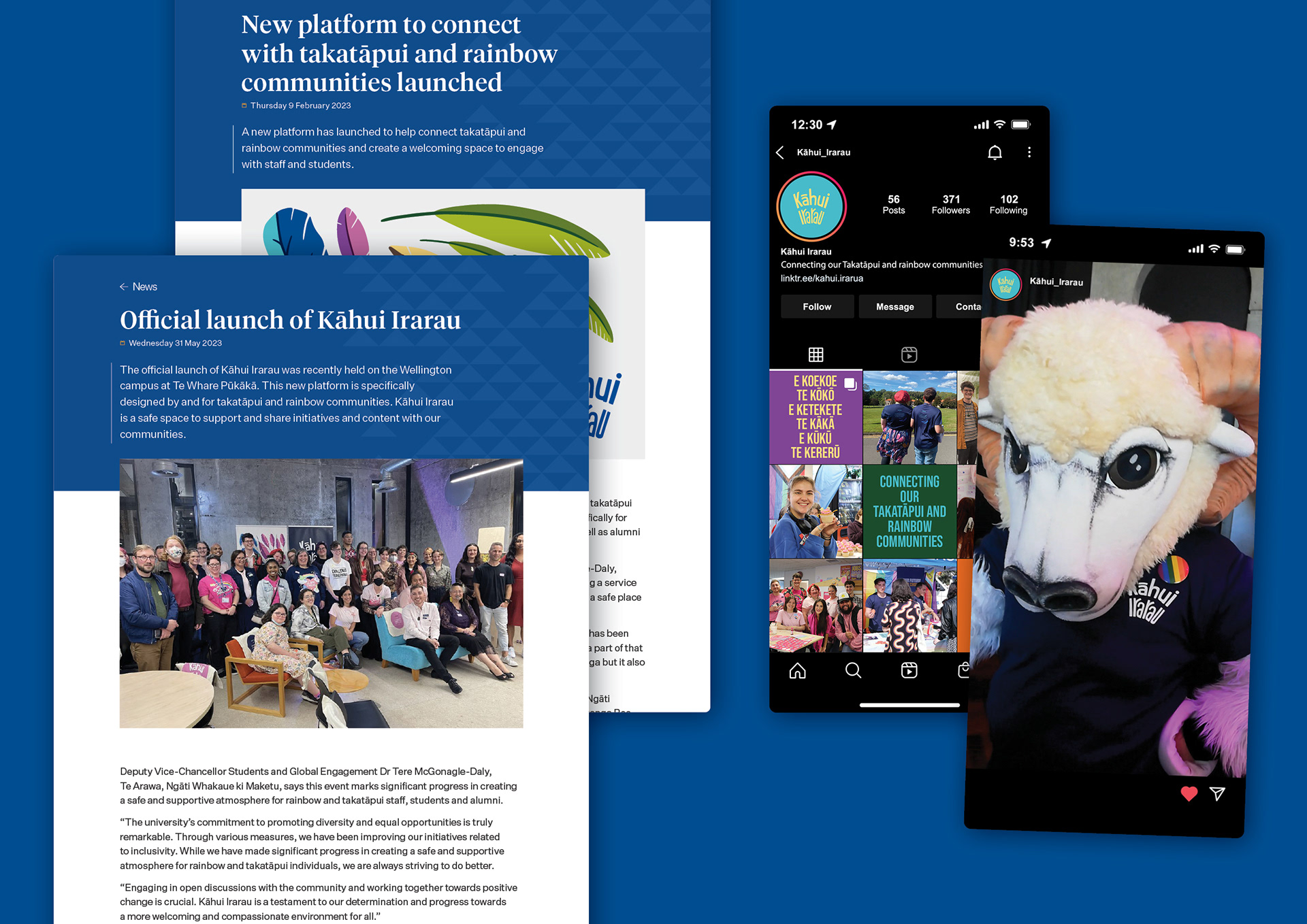
Kāhui Irarau continues to soar. The University saw its first-ever rainbow orientation occurring across all its campuses, with 600+ students participating. 1,500+ people visited their stands at the Big Gay Out and Out in the City. They participated in Sweat with Pride, raising over $5,100, have seen their socials grow, and ninety people attended their launch. They recently presented at the Cross-agency Rainbow Network Conference about indigenous knowledge and connecting Takatāpui and rainbow communities in the tertiary sector and have a lot more planned.